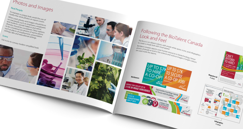
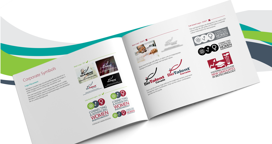
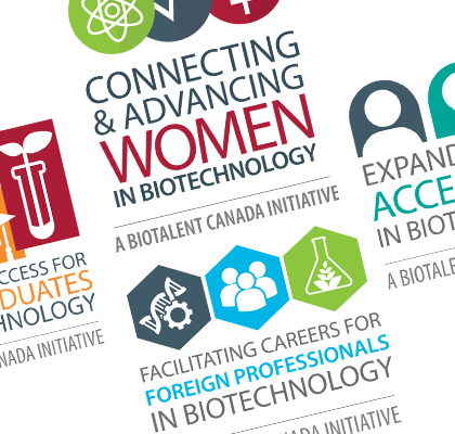
After investigating BioTalent’s brand guidelines, it was apparent that the values indicated for the colours did not match their respective print and web values. BioTalent preferred a brighter red, so a new Pantone colour was chosen, and secondary colours were updated to match this colour, as well as to work in RGB, CMYK, and on all screens and devices.
Once the colours were updated, their brand guidelines were also refreshed. Newer projects replaced old samples and the sub brand logos we created were given guidelines of their own.
The final deliverables included new colours with proper values to work in web and print, and a new brand guideline to be used for all future communications and marketing material.